
A person very close to me works for a company that provides Customer support and they use Salesforce to store their cases. One day I noticed them looking at the screen, they had a list view of Cases opened and there was a column with Red, Amber, and Green boxes to show the severity of those cases. They ordered the list view by this column and were moving their head up and down looking at the screen quizzically, trying to see something, so I ask them, “What on earth are you doing?”. The response I got back changed my perspective on implementing RAG visuals forever.
There are a few different types of colour-blindness – and the one that we are talking about here causes the user to mix reds and greens together and have difficulty recognizing which one is which. So, what was happening in the situation above was:
- When a list view with colourful boxes is in its default order, the person cannot really recognize which colour is which so they tried to order the list view by the colours themselves
- What then happens is that they are certain that the boxes will be the same colour one next to another, and at a certain line a different colour starts
- And the moving up and down and looking at the screen from different angles was them trying to see when the shade changes to be able to recognize the severity of the cases
Can you imagine working like that?
Next time I was implementing Salesforce for a client they had a request – “Can we show a Red, Amber, Green visual to determine the priority? Just 3 colourful circles will be fine, like a traffic light.” My thoughts immediately went to that moment where colourblind people need to affect workarounds to even see which colour is which. So instead of just coloured circles or boxes I started using different solutions:
- Use text with the colours as well
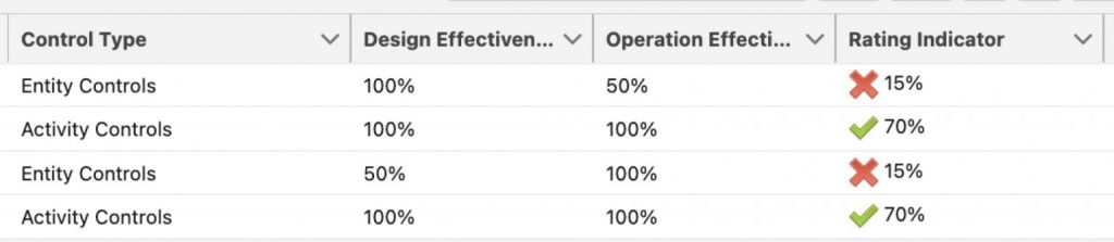
- Use different shaped icons of red, amber, green colours instead of the same shape – crosses, ticks, exclamation points, flags, you name it
And now to the fun part – how do I build this in Salesforce?
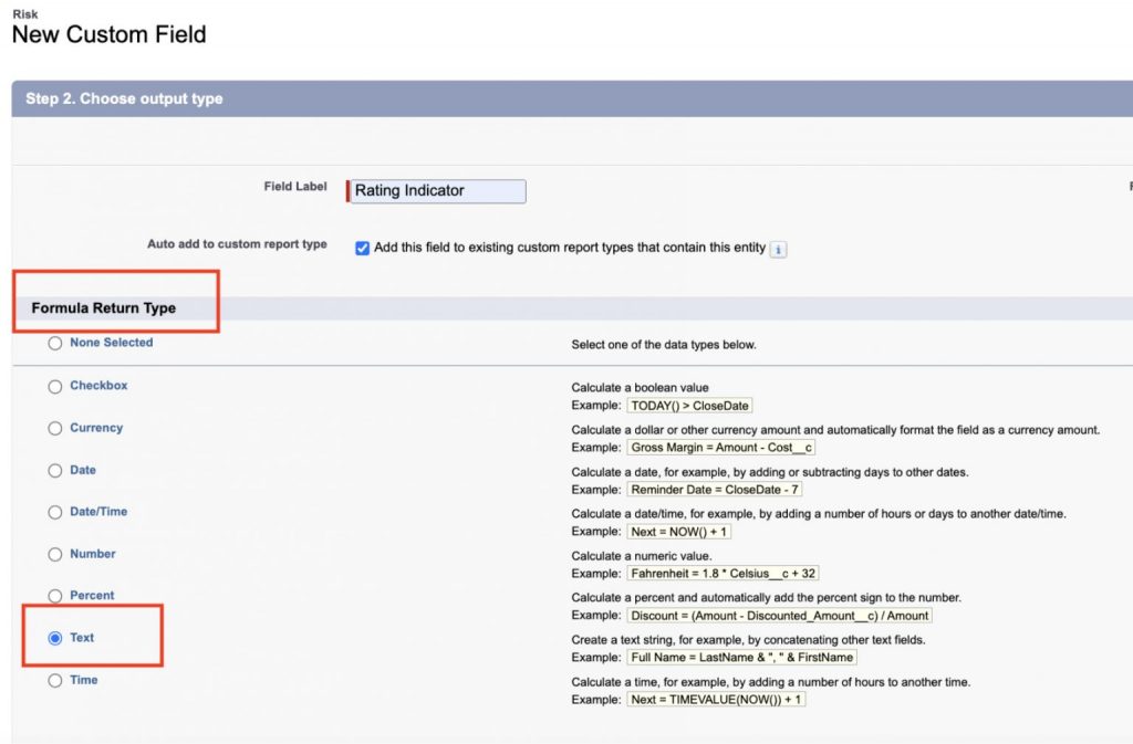
Formula fields with images
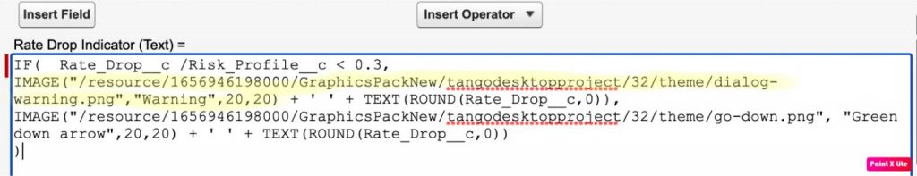
To do visual representation of another field (or collection of fields) on a record we would use a formula field with the IMAGE() function. It’s also worth noting that you want to name your formula field something sensible – you don’t want to use the exact same name as your value field, because reporting or list view building may become difficult (there’s two fields with the same name, which one do I use?!). I like to use the word “indicator”. So, if the “Priority” field contains values High, Medium, and Low – our formula with the images would be called “Priority indicator”.
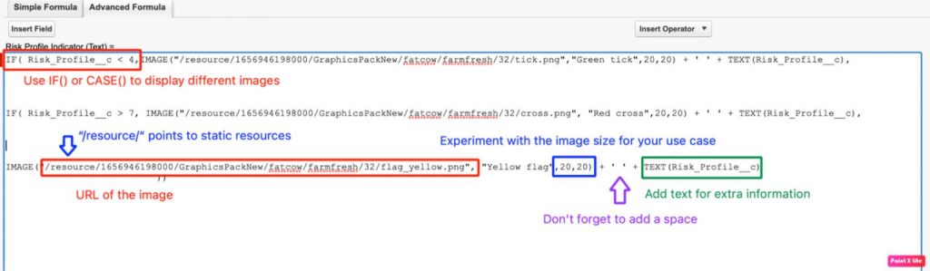
- In some instances, you might want to append text next to your image to clarify the meaning of it – this works best if you want to use different wording than the actual value selected, or you are calculating based on multiple fields. I wouldn’t use the text if it’s an exact duplication of what the original values are, and the fields would be displayed in the same area. It just duplicates the same information and may seem confusing to the users.
2. The other option is to select different shapes for your Red, Amber, Green. I have used different combinations in the past based on the context in which they are used
Just make sure you alternate between the shapes – having a green flag, amber flag and red flag has the same effect as our circles or boxes in the example above.
Icons
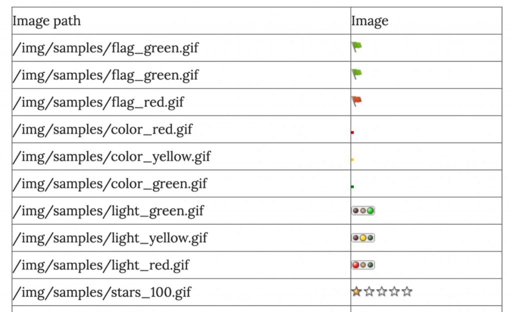
Salesforce has a set of standard icons that can be used without importing any images, they live in the “/img/samples/” folder on the platform. The following link has a list of all the icons: Learn more
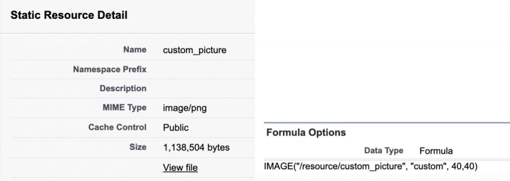
Alternatively, you can upload your own icons to Salesforce – there are two options: Files or Static Resources. I recommend using the Static resource route because these can be easily deployed between orgs and sandboxes along with the formula fields.
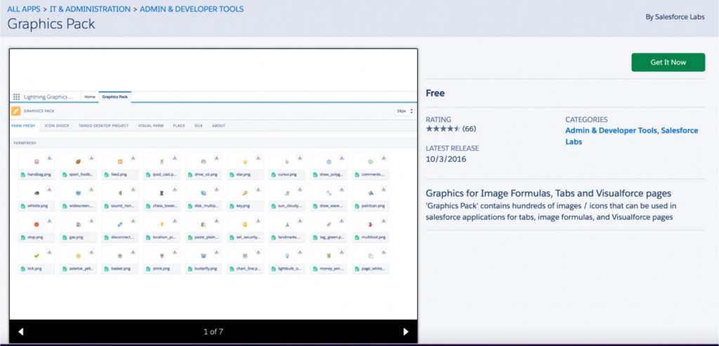
Or there are some AppExchange packages that come with a large set of icons that can be used to browse icons. Graphics Pack – Salesforce Labs: Learn more
So, there you have it! At Persistent we are now standardizing these rules to ensure nothing falls through the cracks; By making some simple changes we are creating a more inclusive solution for end users and by standardizing this approach we are creating market-leading best practice. We are sharing this so that the next time a client asks you for Red, Amber, Green you feel inspired to make your solution more inclusive for our colourblind friends!